1st Year Game Dev #1: "The One Button Game" or "Bog Hop"

Introduction
This project marked the beginning of my Computer Game Production journey. The first assignment given to me, and my assigned partner on this project, was to design and produce a "One Button Game", a game with only one button as an input, within two weeks. It was suggested that we use Unity as our game engine, although any engine would be allowed.
The Concept
During my discussions with my assigned partner I outlined a possibly ambitious idea I had for this project. The initial concept was as follows:
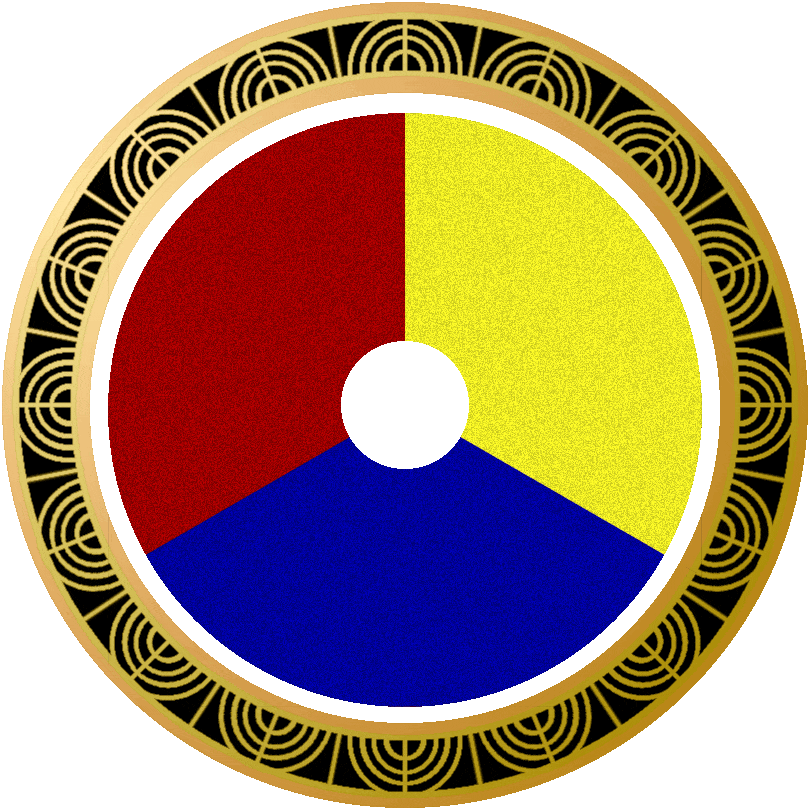
A frog repeatedly jumping in place on a Lilly Pad in a murky pond, swamp or bayou. Each time the Frog lands (and subsequently jumps up) the Lily Pad changes colour. Initially the Player would have to click/tap and hold on the Frog then a colour wheel would emerge; they would then have to drag their cursor/finger to match the Lilly Pads colour on the colour wheel. If they get the wrong colour by the time the frog lands again then the Lilly Pad will reveal itself to be a carnivorous plant that eats the frog. Each jump the frog does gains the Player a point, as the players points increase more colours would get added to the colour wheel. I outlined the possibility of adding an outer level to the wheel, which would involve an outer layer to the colour wheel, with patterns as well as colours. Unfortunately due to the scope small scope of the project and the short timeline, we did not implement the second layer to the colour wheel.
The Journey
The first thing that I needed to do was to make contact with my assigned partner and come up with an idea together. I already had some version of the above concept in mind from the moment of the brief, so it was the first thing I pitched to my partner.
I reached out via discord, unfortunately my partner wasn't available to meet in person that afternoon, but stated he would be available online that night to discus our project. Currently the global workforce is undergoing an interesting post-pandemic change in many industries, whereby working remotely and working from home are becoming more commonplace. It provides both benefits and drawbacks, and I saw this as an opportunity to experience how starting and maintaining a project remote from my partner could impact the work flow. However, I did fully intend to meet up with my partner and tackle many aspects of this project together in person. I believe that although remote work can have it's benefits, working together in person can lead to better team cohesion and a more unified vision for the project.
Unfortunately I was unable to organize a face to face meeting with my partner until the beginning of the second week. By this point we had already discussed our rolls on discord. As my partner was learning programming, and I consider myself relatively artistic we decided that I would tackle the sprites, animations and other art such as the UI and menu banners.

The Art

After discussing the concept it was time to set a deadline for the concept/pre-production phase. We decided that by the first Thursday we should have some concepts ready so that when we go into our Art Skills and 3d Modelling modules we would have a definitive vision/direction that we want to take the project in.
To begin with the process of coming up with concept I tried to come up with a mood board for the art. I had previously mentioned "Cup Head" as an inspiration for the art style, upon further research the name of that art style is called "Rubber Hose". It originates from a style of art and animation from the 1920's which fell out of style in the 1930's. The drawings had to be mass-produced and able to create the illusion of movement in a new industry of moving cartoons. Artists compromised by making characters less detailed and time-consuming to draw, however their movement and animation was often exaggerated or unrealistic.
Initially I wanted to test AI generated imagery as references so I input the phrase “Rubber Hose Style of Art of an Anthropomorphic frog” (and other variations of this phrase) into DALLE.E 2. Unfortunately DALLE.E 2 was able to discern that I wanted a cartoon frog, but it got confused by the “Rubber Hose” input, producing varied images of cartoon frogs holding hoses (pictured bellow). I also tried “Cup Head style art” as an input, which also confused the AI, and put frog heads inside of cups (pictured to the left).


I finally tried a second AI image generator, Dream Studio, for a few more attempts at frog images and also for reference images of cartoon swamps. Once more the frogs (pictured to the right) didn’t come out as I had hoped, in fact they were slightly unsettling.
The Swamp images (pictured bellow) turned out much better. The 1920’s Rubber Hose art style was more evident in many of the pictures and, alongside actual images of swamps, they served as good artistic inspiration and references.


After my experiment with AI didn’t produce any useful reference pictures for our Bog Frog character I decided to to a short study into famous Rubber Hose characters and animations such as Steamboat Willie, Popeye, Betty Boop and even the later popular Cup Head game would serve as good references for this project. I quickly put together a couple of inspiration boards and a simple style guide.
My first mood board included many famous Rubber Hose characters (some of which are depicted bellow- right) as a study into the different forms that Rubber Hose characters could come in, and which designs are still iconic today. My second mood board (bellow- middle) was more specific to Rubber Hose Frogs, as a study into what aspects of the frogs form have worked in Rubber Hose in the past. My final mood board was more of a style guide (bellow- right) for Rubber Hose, a study into what shapes and forms define the style.
I initially started my design process sketching on tracing paper. This method allowed me to take aspects of some of my sketches that I liked and apply them to other designs. The use of tracing paper also provided a similar experience to that of 1920’s animators who overlaid their sheets on an animator light desks.

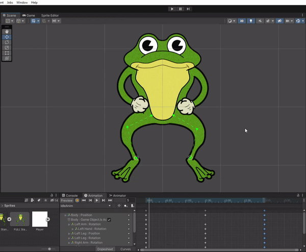
My initial sketch depicted Bog Frog as a lanky/tall character with very straight legs, drawing more inspiration from Michigan J frog and images of real frogs jumping, in which their legs look very long and straight. This 1st design had some aspects that can be found in the final design. The webbed feet hardly changed throughout the design, and the general body shape didn’t change too much either.
My second iteration drew more of a focus on the legs and arms looking more curved and noodle like (no joints). The curvature in their design was to accentuate the fact that this was a bouncing character, the curved legs looked more ready to bounce than the straight legs. Although many Rubber Hose character had jointed limbs, with little elbow and knee bulges (see Popeye characters for good examples of this), the noodle arms were a stylistic choice to give Bog Frog a cuter, simpler look.
Before the third design I decided to experiment a little with the face and eye designs. Focusing first on the eyes, I was fairly sure I was happy with the current design that I was using, a large pupil with a notch taken out of it. However looking at multiple Rubber Hose images there were a few different styles worth experimenting with. Some without the notches taken out of the pupil, some circular, some oval and some simply floating above the face. Ultimately I decided I was happy with the initial design that i was using (circular with a notch). However I wanted to make sure that the eye looked more like it was part of the head so I included a surrounding brow.

I experimented further with the shape of the head (pictured left). My first two designs had a more circular design, which contrasted with the wide chest. This meant that the chest drew the players eye more than the face did. My initial though was to enlarge the circle or widen the head into an oval shape, however these designs looked a little too warped. I had to go back to my reference images and noticed that the best Rubber Hose frogs had the head almost merged with the body, with no discernible joint or neck. I tried two versions of this technique. The first attempt I widened the head a little and brought it lower to the body, whilst maintaining a clear division between the head and body. The second attempt was an experiment in ludicrousy, by removing the barrier between head and body the character looked like one big head with arms and legs. I settled on the first attempt and that became the basis of my third and final character design.
After checking in with my partner and making sure he was happy with the design I had settled on I scanned my work in, and made a digital version of Bog Frog which would become the basis of my sprite animations. To maintain the 1920’s animation aesthetic I applied noise overlay on the images to give it a grainy/paper texture. I also exported 3 different versions of each of my sprites. The logic behind doing that was that we would only want the colour of the green part to of Bog Frog to change, therefore the outline, eyes and cream chest would need to be a separate file. The intention was to have the “Outline Sprite” overlaid on top of the “Fill Sprite”, and animated them to move in tandem.

This was my first time making any game. My partner and I decided to go with Unity, as that was the engine suggested to us, so this was the engine i would have to do my research on for animation and sprites.
In my initial search to discover how to animate a sprite I found out that the initial image had to have all it’s moving parts separated in order to apply bones and geometry to it. I went back and did this to all versions of the sprite that I had made. I also animated each of the sprite images depicted above, in the hopes that i could combine all of the segments of animation into one fluid jump animation that would be set to repeat. Upon discussion with my partner this would have been too hard to implement in the time we had been given so instead I made a sprite sheet and animated the jump from the sprite sheet. This gave the animation a very choppy, less fluid feel to the movement of Bog Frog.
Having learned from this experience, in the future I would either make all the animations and movements possible through the “bones” method, or spend more time on the sprite sheet making the animations look more organic.

The core challenge of the game was to match Bog Frogs colour to the changing colour of the Lilly Pad, or else it chomps Bog Frog and the player loses. I used simple reference pictures of Lilly Pads and their flowers to come up with a concept of the dormant state Lilly, and drew inspiration from the plant from The Little Shop of Horrors, Audrey II, for the chomping state Lilly.

Using the same sprite sheet method (pictured above) I made 3 sprite sheets. I did this for the same reason that I made an Outline, Fill, and Complete version of the Bog Frog sprites. We only wanted the flower part of the Lilly Pad to change colour. For the same reasons as Bog Frog we settled on just using the complete version of the Lilly Pad sprite sheet.
To maintain the 1920’s aesthetic we wanted the user interface to have an Art Deco appearance. Given more time I would have probably spent more time on the game banner and the start button (pictured far right-bottom). However I was very happy with how the colour wheel turned out (pictured right-left). Each colour would be it’s own sprite and function as a button. I used the same noise overlay on the colours as I did Bog Frog, to give the colours a grainy/papery texture.

Speaking with my partner we had moved away from the click and drag mechanic that we originally came up with, instead electing to have the colour wheel take up the right side of the screen, with the frog and Lilly Pad situated on the left.
Ultimately my partner struggled to implement the colour wheel into his button layout, and simply used four square block-colour buttons. The GIF to the right depicts the colour wheels difficulty progression that would have happened, had it been implemented.
Reflection
My Partner and I had met up a few times to work in tandem, to make sure core principals and concepts could work, and to have an understanding of what each of us were doing. A couple of days from the deadline the assets and animations were complete. I had been checking in with my Partner to make sure the coding was going well and all that was needed was to apply the assets. Unfortunately he had been struggling with the loss condition, and couldn’t get the game to reset after a loss. The day of submission he decided to swap over to Java Processing due to prior use and knowledge. This of course worried me, it was the day of submission, that not a lot of time to program even a simple game.
Ultimately by the deadline we did not have a working or finished project. This was very disappointing as it was a concept that I feel could have been a lot of fun. From my end there are many aspects of my asset work that I am happy with, other assets I would have spent more time on, and animation I would have polished. As a student of production I have used this project as a lesson in management and communication within this industry. It is clear that meeting in person more frequently and discussing road blocks that other team members are experiencing, even if it is not a field that I am familiar with. Had my partner and I got together more often maybe we could have come up with creative solutions that would have left us a finished product.